You are currently browsing the tag archive for the ‘coordinating textures’ tag.
Tag Archive
Perfectly Coordinating Fabrics and Textiles
August 9, 2010 in Uncategorized | Tags: accent chairs, accessorizing a home, beautiful home, chairs, coordinating fabrics, coordinating patterns, coordinating textures, coordinating wallpaper and fabric, custom draperies, custom made draperies, custom made roman shades, custom valances, custom window treatments, decorating, decorating with fabrics, decorating with wallpaper, home decor, Interior decorating, interior design, interior designer, Reupholstering | 1 comment
One of my favorite parts of my job is combining and coordinating fabrics and textiles. When you see a perfectly designed room in a magazine, you often fine combinations of fabrics, patterns, textures and colors that you probably wouldn’t have thought to put together yourself, yet they look so perfectly executed within the design. There is an art to combining fabrics and textiles to get a beautiful, cohesive, well-designed look. But it doesn’t have to be so difficult. Here are a few simple rules I use to help me perfectly combine fabric and textiles in my designs.
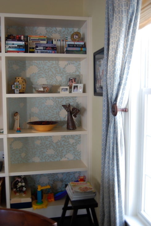
* Find a unifying color – you can easily combine different patterns of fabrics and textiles if you choose one unifying color among all of them to tie them together. For example, in my family room I have chosen blue-green as my unifying color. I have successfully been able to combine a small Ikat print in small accent pillows, with a slightly larger geometric in the draperies, a solid silk accent pillow and a floral metallic wallpaper in the back of the built-in, using the blue green as the unifier. The sofa is a darker blue and the rich dark woods around the room help to ground it all.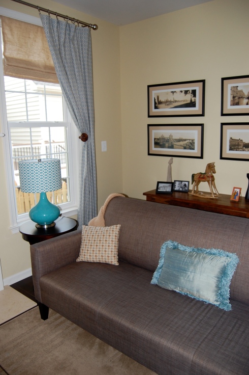
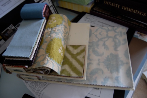
*Choose one fabric and pull your other colors from that one fabric. It should be a bolder fabric and should be the used as the highlight or centerpiece of your design. For my master bedroom I have selected several beautiful fabrics from Thibaut for my upcoming redo. In this case, I fell in love with the bold floral print. I pulled the blue out again in the fabric for the soft shades. The green Ikat will either be cornices above the shades or accent pillows and the solid blue will likely be the custom uphosltered headboard. The large print floral that I fell in love with will be the new upholstery on a new pair of chairs I have yet to find.
*Don’t forget about texture. Varying your texture can help to add depth to your design. Even if you are using the same color or a more monochromatic color scheme, varying the textures can help give life and depth to the design of the room. Consider combining a chenille with a woven with a wool and add a bit of silk for glamour.
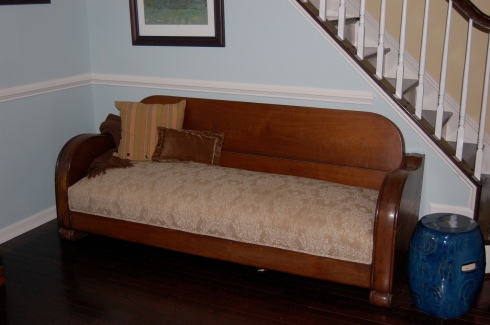
*Use textured solids or tone on tone, large scaled patterns on the large pieces and add punches of busier pattern and textures in your smaller pieces. By using textured solids or tone on tone on your larger pieces you are keeping them more neutral, making it easy to change out your accents later on. If you put a large, heavy or busy print on a larger piece (such as a sofa), it can limit you if you choose to change your decor down the road.
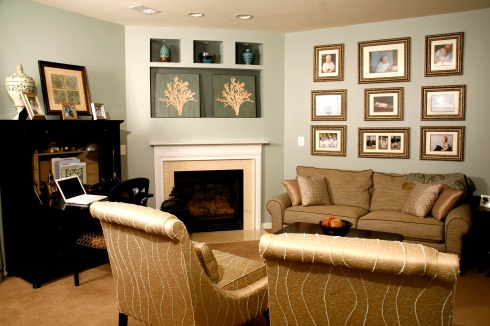
A textured neutral on the sofa and tone on tone modern metallic fabric on the chairs allows us to play with other patterns throughout the room in this Alexandria home.
Selecting fabric patterns and textures can be a lot of fun and can really help to pull together the design of your room. Don’t be afraid to try unique and unusual combinations of fabric patters and colors. You just might surprise yourself at the cool new look you might create.

