You are currently browsing the tag archive for the ‘interior design’ tag.
Tag Archive
Masculine Yet Stylish Window Treatment Design
March 17, 2011 in Uncategorized | Tags: accessorizing a home, cornice board designs, custom draperies, custom made draperies, custom window treatments, decorating, faux wood blinds, Graber wood blinds, home decor, Interior decorating, interior decorator, interior design, interior designer, window treatment designers, wood blinds | 1 comment
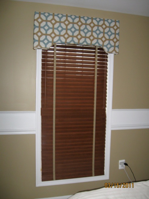
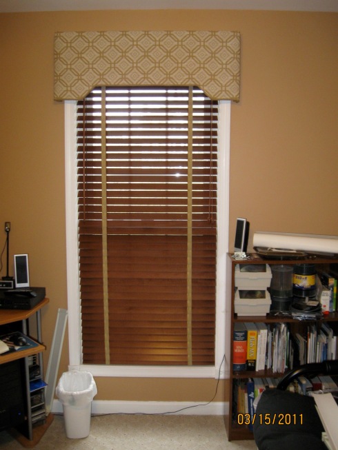
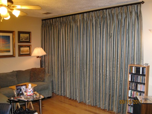
I’m so excited about our latest window treatment install. This one is for a retired gentleman who lives in a great little condo in Stephens City (near Winchester), VA. He wanted something functional to give him privacy when necessary and to allow natural light to flow during the day. He also wanted something updated and stylish. We chose to go with wood blinds from Graber in cherry finish to match his existing furnishings. For style we added beautiful cornice boards in fabrics that are masculine in style but full of life and texture. They work amazingly with his new paint colors. In the living room we needed functional draperies to allow him privacy at night. We did a very classy blue/brown/green faux silk striped fabric that just pops against the wall color and ties his artwork and furnishings together. The rod is traversing in bronze finish to match his new ceiling fans.
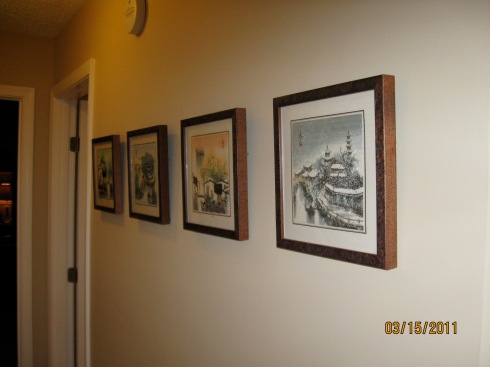
Part of our work with this client was helping him to hang his fantastic collection of artwork from his travels across the world. We chose to display is art in groupings to make them more substantial and to have them really attract attention. When hanging artwork, groupings tend to create a very dramatic display that calls for conversation. Check out how we did.
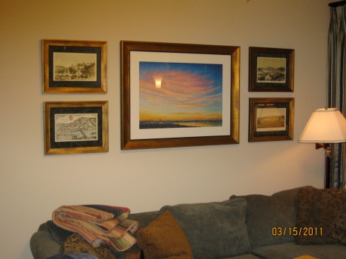
We had these reframed by a professional framer (Digital Recollections) to really bring out the colors and beauty of the art.
Rate this:
Tuscan Inspired Family Room for a Modern Family
March 7, 2011 in Uncategorized | Tags: accent chairs, beautiful home, benjamin moore paints, concord ivory, custom draperies, custom made draperies, custom valances, custom window treatments, family room design, fireplace ideas, Interior decorating, interior decorators, interior design, interior designer, tuscan design, tuscan inspired design, tuscan room, yellow family room | 2 comments
When this Gainesville, Virginia family first approached me to design their family room I didn’t know they would become one of my absolute favorite clients. Judging by their collection of beautiful items for around the world, they have great taste, there is no doubt about it. But the more I got to know them, see them interact with each other and the way they totally and completely collaborated with me on their design project was so easy going and positive, it made every moment of designing their space and implementing their design so pleasurable and easy. When we first started talking they shared with me stories of their travels and their collection of amazing furnishings and accessories from around the world. They also shared that they enjoy spending time with their tween children at home and wanted to create a family room that made them all feel great. It had to be comfortable for lounging and watching movies together, doing homework, as well as mild entertaining. It also had to feel incredibly warm and inviting. They wanted to incorporate a mildly Tuscan feel without it feeling thematic or over the top. They wanted the warmth and texture of Tuscany with the an updated feel.
The Design
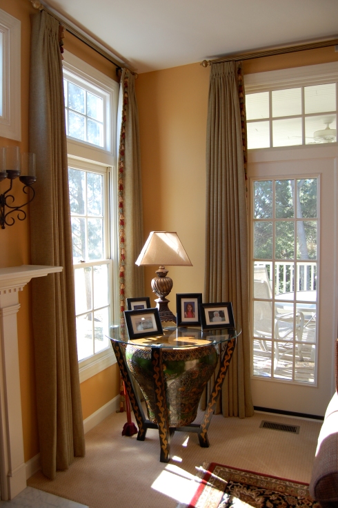
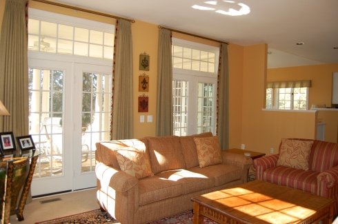
Together we landed on a warm, golden yellow that just brightens up the space and invites you in. I then brought in a lot of texture and contrast with the olive colored draperies. I embellished them with red, green and gold fringe trim on the leading edge. A simple french pleat header adds to the traditional feel. We hung them from vintage gold wood traversing rods to finish off the look. On the sofas we went more bold with the red and gold stripe on the chair and a half and a textured red with gold undertones on the sofa. The accent pillows tie the fabrics together. The piece de la resistance is a gorgeous accent chair which I upholstered in a red fabric with grey/black medallions. A small accent table and floor lamp creates a comfy reading nook for early Sunday morning paper reading. Here are the results:
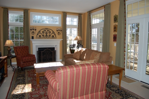
Sofa, chair and chair and a half are from Bassett Furniture. Draperies are Creative Elegance Interiors. Fireplace arched accent is from Uttermost and fireplace screen is from Willow House.
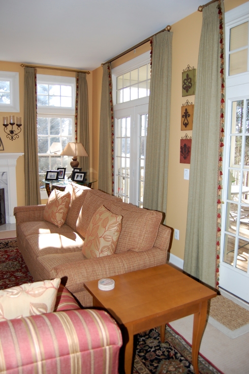
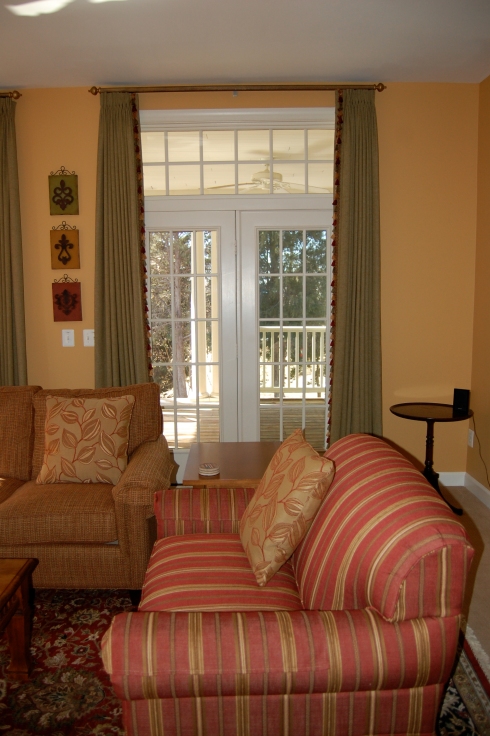
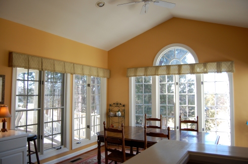
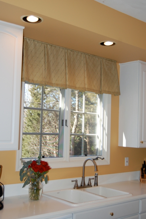
We tied the breakfast area and kitchen to the family room by adding short box pleated valances in a decorative, embroidered fabric in a slightly lighter green color. We kept the breakfast room treatments short so as not block out any great natural light.
Rate this:
Headway on the Master Bedroom Redo – FINALLY
February 11, 2011 in Uncategorized | Tags: Interior decorating, interior decorator, interior design, master bedroom design, master bedroom lighting, master bedroom redo, swing arm wall sconces, upholstered headboard, wall sconces | Leave a comment
Don’t look at the bedding. Do instead look at the headboard and lights. We finally got our amazing upholstered bonnet style headboard in from Bassett last week. We also had our sconces installed. We purchased the Chelsea Sconces from Pottery Barn. They come as plug ins but a very good friend who’s an electrician helped us to hard wire them. They are fabulous. Now we can control them from the light switch or from the sconces. They are two way so we can have both mood lighting and task lighting. The headboard was made by Bassett Furniture. However I did COM (customer’s own material) on the fabric. I used the same linen fabric that I used for my master bathroom cafe style draperies. Its soft, textural and easy. Its hard to see in the pictures for the color is lighter than the walls so it does stand out without being overwhelming.
So what’s next. I’m headed out to buy the materials for the cornice boards. Those should be the next portion. The duvet is being made, can’t wait to show that off. Then its the bedskirt and light fixture. Finally I hope to purchase a comfy chair and ottoman and bench for the end of the bed. A few mirrors and some well placed accessories and the room will be complete. Stay tuned!!!

Rate this:
Perfectly Coordinating Fabrics and Textiles
August 9, 2010 in Uncategorized | Tags: accent chairs, accessorizing a home, beautiful home, chairs, coordinating fabrics, coordinating patterns, coordinating textures, coordinating wallpaper and fabric, custom draperies, custom made draperies, custom made roman shades, custom valances, custom window treatments, decorating, decorating with fabrics, decorating with wallpaper, home decor, Interior decorating, interior design, interior designer, Reupholstering | 1 comment
One of my favorite parts of my job is combining and coordinating fabrics and textiles. When you see a perfectly designed room in a magazine, you often fine combinations of fabrics, patterns, textures and colors that you probably wouldn’t have thought to put together yourself, yet they look so perfectly executed within the design. There is an art to combining fabrics and textiles to get a beautiful, cohesive, well-designed look. But it doesn’t have to be so difficult. Here are a few simple rules I use to help me perfectly combine fabric and textiles in my designs.
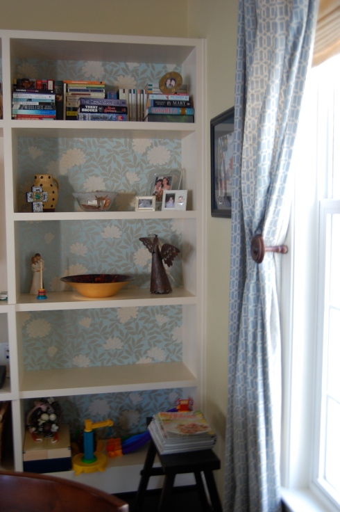
* Find a unifying color – you can easily combine different patterns of fabrics and textiles if you choose one unifying color among all of them to tie them together. For example, in my family room I have chosen blue-green as my unifying color. I have successfully been able to combine a small Ikat print in small accent pillows, with a slightly larger geometric in the draperies, a solid silk accent pillow and a floral metallic wallpaper in the back of the built-in, using the blue green as the unifier. The sofa is a darker blue and the rich dark woods around the room help to ground it all.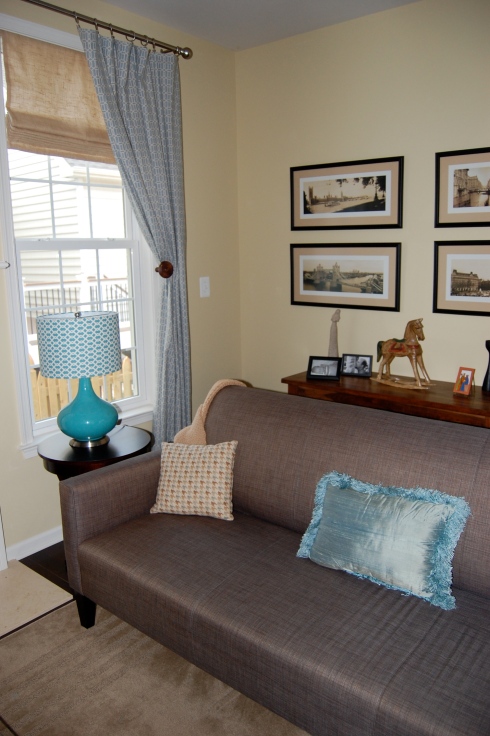
*Choose one fabric and pull your other colors from that one fabric. It should be a bolder fabric and should be the used as the highlight or centerpiece of your design. For my master bedroom I have selected several beautiful fabrics from Thibaut for my upcoming redo. In this case, I fell in love with the bold floral print. I pulled the blue out again in the fabric for the soft shades. The green Ikat will either be cornices above the shades or accent pillows and the solid blue will likely be the custom uphosltered headboard. The large print floral that I fell in love with will be the new upholstery on a new pair of chairs I have yet to find.
*Don’t forget about texture. Varying your texture can help to add depth to your design. Even if you are using the same color or a more monochromatic color scheme, varying the textures can help give life and depth to the design of the room. Consider combining a chenille with a woven with a wool and add a bit of silk for glamour.
*Use textured solids or tone on tone, large scaled patterns on the large pieces and add punches of busier pattern and textures in your smaller pieces. By using textured solids or tone on tone on your larger pieces you are keeping them more neutral, making it easy to change out your accents later on. If you put a large, heavy or busy print on a larger piece (such as a sofa), it can limit you if you choose to change your decor down the road.
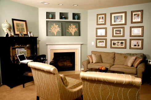
A textured neutral on the sofa and tone on tone modern metallic fabric on the chairs allows us to play with other patterns throughout the room in this Alexandria home.
Selecting fabric patterns and textures can be a lot of fun and can really help to pull together the design of your room. Don’t be afraid to try unique and unusual combinations of fabric patters and colors. You just might surprise yourself at the cool new look you might create.
Rate this:
Decorating with Family Photos
August 2, 2010 in Uncategorized | Tags: accessorizing a home, beautiful home, decorating, decorating with photos, family photography, hanging family photos, home accessories, home decor, Interior decorating, interior decorator, interior decorators, interior design, interior designer, photos as art | Leave a comment
This past Sunday the Washington Examiner highlighted one of our client projects (http://www.washingtonexaminer.com/economy/real-estate/98860724.html) . The article focused specifically on using family photos in your interior design. The client had an amazing collection of family photos done by a local photographer, Virginia Pixton Payne of Virginia Payne Photography (http://www.virginiapaynephotography.com/). We created some amazing collages on her basement office and stair walls.
I too have started my own family collage on my stairs to my basement family room and wanted to share some additional tips as well as photos on how to use family photos in your interior design.

The start of my family collage. A friend of mine, Rick Reinsch of Digital Recollections (http://www.digitalrecollections.net/Home.html) made the custom mats for me so that I could use these inexpensive frames I already had. I am going to have him do the two larger ones next, just need to pick the photos.
*Make sure the photos are well done. You don’t have to be a professional photographer to take good photos. Here are some simple rules and you will see that your photos will begin to look like perhaps a professional took them.
– Close ups are better than far away. If you are photographing a person, a close up of the person is much more please than a full body shot.
– Get creative with your point of view. Taking a photo of a child from above, or from below can be more artsy looking and creative than taking a photo straight on. Change up your point of view and you will see how creative your photos become.
– Change your focus. Try close-ups with everything blurry in the background, or focus on one child in front and get the second child in the background. Get creative with your focus and you will see how interesting your photos become.
– Think about the lighting. In photography, lighting makes all the difference. Outdoors, try taking photos in the early to mid-morning when the sun is bright but not blaring. Indoors, make sure you have a good flash and play around with your ambient lighting to get the perfect mix.

I took these of my son one night when he was playing with a blanket. I just got creative with the angles and played along with him. They are going on my collage wall ASAP.
*Find one unifying element. Choose one element that will be constant throughout your photo display. It can be as simple as using the same frame, or even the same color frame. Or perhaps all of your pictures will be in black and white, or in color. Or maybe all of your frame sizes are the same. Find one thing that unifies the overall design and get creative with everything else.
*Put multiple pictures together for a more dramatic affect. Creating wall collages turns your photos into art. Get creative with your layouts. Use different size frames to create a less formal, more creative display or use the same size frame for a more dramatic, formal affect.
*It is okay to go overboard. My client Alison had hundreds of photos of her family. They were all beautiful and worthy of display. She also knew she would be getting more as her children grew. We displayed as many as we possibly could and created a rotating gallery for her so that she could easily update them as she pleased. Its your home and your family, using them as your artwork is the most meaningful way to display art. Don’t be afraid to go overboard.
Rate this:
Three Simple Rules for Theme Decorating
July 26, 2010 in Uncategorized | Tags: beach interior design, beach themed design, beautiful home, decorating, decorating with antiques, furnishings, furniture, Interior decorating, interior decorator, interior design, interior designer, man cave decorating, man cave interior design, man room decorating, man room interior decorating, rules of interior design, sports themed decorating, theme interior design, themed decorating, themed room decorating | Leave a comment
I’ve been very busy these days putting together my son’s birthday party and working so I haven’t had too much opportunity to work on my own place. I did finalize the family room and still want to share how my living room has ended up. I also chose the wallpaper that I’m going to be installing in my dining room tray ceiling. I have also decided on window treatments for my master bedroom and bathroom which I haven’t even touched yet as a discussion topic. I will regroup and share more of the work done on my home in my next post but for now I did want to share some great information about theme decorating.
You may think its cool to have a room that looks like you stepped off the plane and into a Hawaiian lu au or like a bomb of West Virginia football parafanilia exploded in your man cave but the reality is, hardcore theme decorating is simply outdated (sorry honey, I know you love your WVU football). The new face of theme decorating requires much more restraint, a bit of creativity and leaving something to the imagination. If you want to have a beach themed home (like my client in the photos in this post) you can do so without making everyone who enters there feel like they should put on sun block. Here are five simple rules to follow when you want to have a themed decor in your home, without over doing it:
1. Leave a little to the imagination – a themed room is a little like good abstract art. You want people to contemplate it without its meaning being slam blam in their face. For example, in my client’s living room we used an accent table made of carved wood. This table serves the function of an accent table where a lamp can sit but it also is reminiscent of a piece of driftwood washed up on the shore. The sofa is the color of sand. The artwork could be waves, or maybe not. Depends on who’s looking at it. The lamp is made of turquoise, it acts like artwork without screaming beach.
If you are doing a man cave, perhaps some abstract photos of the stadium nicely framed and hung in a collage could provide interesting artwork and a conversation piece. If your theme is Asian, simple using grasscloth wallpaper on a couple of walls for texture and adding a red accent wall with black and red accessories can get the point across. You get the idea. Subtle and abstract is much more powerful than in your face and obvious.
2. Don’t over do the accessories – a few themed pieces can be thrown in to the accessories, such as the black and white photos of the beach we put on my client’s walls. We mixed that in with some simple white vases and some white accent pillows with what appears to be pussy willow on them. Some stones simply placed on a turquoise plate offer a bit of texture and interest. No where do you see a bunch of sea shells or sand or seaweed. Go subtle with your accessories, but try to use things considered reminiscent of your theme.
3. Paint can go a long way – that man cave can represent WVU, or North Carolina or whatever your flavor is, with its paint colors. You don’t need to actually paint the big WVU logo on the wall, use the blue as your wall color and use the yellow as your accent color in fabrics, or artwork, or other accessories.
The moral of the story is that themed rooms can be fun and interesting if they are done with care. Gone are the days of the basement tikki bar. Today’s themed rooms are much more subtle and abstract than ever. So enjoy your theme room decorating but do so with caution and restraint.
<div style=”width:400px;font-size:8pt;font-family:Verdana,sans-serif;text-align:left;font-weight:700;margin:0;border:1px solid #9966cc;”><div style=”width:auto;background-color:#9966cc;color:#ffffff;padding:3px;padding-left:5px;”>Paola McDonald’s Expert Author Email Alerts</div><div style=”height:70px;padding:8px;background-color:#ffffff;”><div style=”font-weight:normal;margin:0;”>Sign up to receive email alerts of Paola McDonald’s latest articles from EzineArticles.com!</div><form action=”http://ezinearticles.com/subscribe/alert_sub.php” method=”post”><p align=”center”>Email Address: <input type=”text” name=”email” size=”19″> <input type=”image” align=”top” src=”http://ezinearticles.com/images/submit/purple.gif” border=”0″></p><input type=”hidden” name=”author” value=”Paola McDonald”></form></div><div style=”width:auto;background-color:#9966cc;padding:3px;padding-left:5px;”><a href=”http://EzineArticles.com/?expert=Paola McDonald” style=”color:#ffffff;text-decoration:none;”>EzineArticles.com</a></div></div>
Rate this:
Choosing the Perfect Accent Chair
July 20, 2010 in Uncategorized | Tags: accent chairs, accessorizing a home, beautiful home, chairs, custom window treatments, decorating, decorating with antiques, furnishings, furniture, green interior design, home decor, Interior decorating, interior decorator, interior decorators, interior design, interior designer, perfect accent chair | Leave a comment
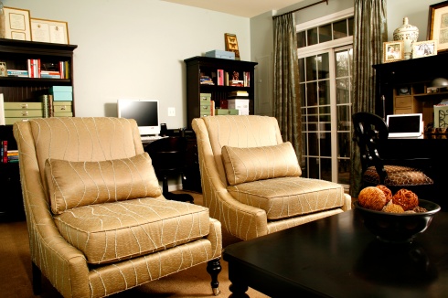
I love accent chairs. If it were up to me, the whole house would be full of beautiful accent chairs in all sorts of fun and funky fabrics. I guess it is up to me, however, having a home full of fun and funky accent chairs would not be very practical for my growing family. So I’ve settled a few beautiful accent chairs in interesting design styles and textures to finish off my living room and family room and am excited because I have found the perfect fabric for some accent chairs that I will one day have in my master bedroom. Accent chairs are a great way to add additional, movable seating to a space and to add pops of color, texture and/or interest to as space. Because they are usually a bit smaller, they can easily withstand a bolder fabric that really reflects you style. Because they are smaller they are also easier and less expensive to reupholster if you happen to get sick of that bolder fabric. There are many incredibly beautiful chair design styles you can use in your decor. The slipper chair has become quite popular in recent years as a great accent chair choice. Here is a picture of a pair of slipper chairs I have used in my family room. If you read my blog this is not the first time you’ve seen these. Recently we purchased the second chair to match and finish off the seating in the living room. It is the Bassett Furniture Chandler Chair in Raffia.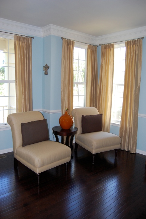 You’ve also seen the beautiful, t-back exposed wood chairs upholstered in a blue knit fabric. These finish off my family room so nicely. The fabric is actually quite soft and the chairs are really comfortable. Yes, I said I was done in there but honestly, my work is never done. We switched the wood coffee table we had in the family room to the living room and bought the Peekaboo Coffee Table (www.cb2.com) CB2 last week. We love how it opens up the space and allows a full, clear view to the fireplace. Here are other beautiful accent chairs from other projects we’ve worked on:
Rate this:
Should I Reupholster that Sofa? or Chair? Or…
July 14, 2010 in Uncategorized | Tags: accent chairs, accessorizing a home, antique, antique sofa, beautiful home, chair reupholstering, chairs, choosing a fabric for reupholstery, custom draperies, decorating, decorating with antiques, furnishings, furniture, green decorating, green design, green interior design, green paint, Interior decorating, interior decorators, interior design, interior designers, refinishing furniture ideas, Reupholstering, reusing furniture, sofa reupholstering | Leave a comment
As I said in my last post, reupholstering old pieces is a great way to give them new life and to recycle. It can save the piece from being tossed and in some cases can save you money from having to buy a new piece all together (depending on the fabric you choose, if you embellish, etc.) So how do you know if a piece is worthy or reupholstery? There are few tips that I can provide to help you decide.
*How is it holding up? Are the cushions deflated, flattened or lumpy? Has it basically retained its shape over the years? How are the cushions constructed? There are many materials from which your cushions could be constructed, including: down (most expensive), down lined with Decron Polyester fibers or Blendown (still expensive), and polyurethane wrapped in cotton or other fibers (most reasonable) are among the most common fillings. If your cushions are made of high density, good quality foam they will not have broken down (or would have broken down less) over time. Even your cushions are not holding up, however, there are other factors to consider in the construction of your sofa so don’t let this be the only deciding factor. A good upholsterer can always provide you with new cushions to replace poor quality ones (of course, this will add to your overall price).
Here is another picture of the 50’s sleeper sofa I purchased and had reupholstered in a linen blend fabric…

1950's Sleeper Sofa reupholstered in linen blend. It was in excellent condition and is an incredible quality piece. The cushions needed to be remade and we replaced the mattress. We are very happy with it.
*Does it have good, solid bones? If the piece is sturdy, strong and well constructed, you should definitely consider giving it a facelift. One of the tell tales signs of a quality piece of furniture is the joint system. Good quality pieces have mitered joint systems or are dovetailed or tongue and grooved, and the frames are often glued and screwed together. If the piece is made of particle board or plywood and the frame is held together with staples, it is probably not worth investing in reupholstery for the piece.
*Quality of exposed wood – if your piece has any exposed wood (dining chairs, sofas with wood legs, etc.) what kind of shape is the wood in? If it has a few knicks and scratches it can probably be repaired fairly easily or these can add to the charm of the piece. If the wood is rotted or broken or falling apart, you may want to reconsider as it may be costly to repair the piece. Painting or restaining exposed wood is also an option but you may have to do some heavy sanding to remove any top coat that has been added so that the piece will take new paint or stain. Here are pictures, before and after of my breakfast room chairs which I got from an old neighbor when I fell in love with the back design and I repainted and reupholstered them to be more interesting and updated.

Unpainted, pre-reupholstered dining room chairs I got from a neighbor. They are over 30 years old and were in great shape except for some scrapes and scratches. I had reupholstered them when I first got them in a paisley fabric.
*Does it, or can it work with your existing or new decor? It is important to consider if refacing a piece will allow it to fit more nicely into your decor. There are some very creative things that can be done with old pieces to bring them up to date and give them updated style. You can get creative with your fabric choice. I love seeing traditional wingback chairs in very contemporary or graphic fabric patterns and colors, for example. Don’t discount a piece because it simply looks dated. Think about how you could make it into a contemporary piece that is perhaps fun and funky, or unique, or almost art like. Paint can take furniture a long way these days. Take a look at these pictures…
Rate this:
Simple Ways to Decorate Green
July 11, 2010 in Uncategorized | Tags: antique shopping, antique sofa, aura, buying local furniture, decorating with antiques, green decorating, green design, green interior decorating, green interior design, green paint, Interior decorating, interior decorator, interior decorators, interior design, natura, refinishing furniture ideas, Reupholstering, reusing furniture | 1 comment
I am sometimes overwhelmed at the thought of going green. I know I have to do it, I know how important it is but I also know that it can be challenging. There is so much to think about, and research and learn and do to go green. I often find myself frustrated that I am not doing more. Then I take a step back and realize that every little bit that I do helps and that it is becoming much easier to do more and more, its becoming a lifestyle, a gradual change that, because it is important to me, is naturally occurring in my life. I wanted to break down a few simple steps that I have taken to be more green in my own personal decorating. I hope that you can take a few these ideas and incorporate them into your lifestyle so that you too can contribute to preserving mother nature.
*Recycle – don’t just throw out that old piece of furniture or accent pillow or accessory – think about a new way that you could reuse it in your design. Perhaps reupholster it (in an organic fabric would be best, or in a great remnant that you find at your local fabric store). Perhaps just moving to another room can give it a new life. Maybe it needs refinishing, at the same time helping a small local business by providing them work. Try to think outside of the box and give the old piece new life.
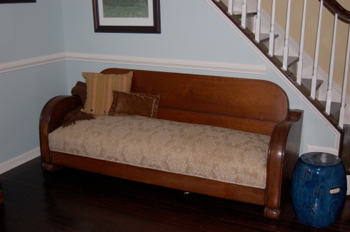
If it simply won’t work with your decor, think about consigning it. You can make a little money while letting someone else give the old piece a new life. Check out this sofa that I purchased at an estate sale and had reupholstered and some other treasures found at antique shops…

Reupholstered sofa bed from mid-century modern estate sale. It currently resides in our office space for additional guest sleeping.

Old wagon wheel found at antique shop in West Virginia. It will be hung on the wall as cool modern art piece.

Antique mold also found at antique shop in west Virginia. It will either become a table or a wall mounted art piece.
*Buy from local consignment stores and antique shops – give those old pieces a new lease on life. I am a consignment store junkie. If you read my blog you know how often I find fantastic treasures at STUFF and The Very Thing in Haymarket. I love treasure hunting and finding unique pieces that you won’t fine anywhere else. Paint, reupholstery, refinishing can all go a long way and can bring out your creativity. Craigslist is also a good place to find quality home furnishings and other items at great prices. I have found the most amazing chairs on Craigslist. Check them out…

Aren't they amazing? I got so lucky with these. The seller had just purchased them and then changed her decor. There were many people after these...
*Buy local – find furniture and other household items that are made locally. I am a Bassett Furniture dealer partly because Bassett manufactures much of it furniture right here in Virginia. I give local, small companies business as often as I can and I try to make sure my fabrics and furnishings are made in the USA as much as possible. We live in a global economy where its often hard to tell where things are coming from. Simply asking the question and doing a little research can go a long way. Check out my Bassett Furniture chairs and dining table…

Chandler chairs upholstered in Raffia with Chocolate accent pillows from Bassett Furniture. The lamp base without a shade is STUFF find. I am waiting on the new shade.

Louis Phillipe pedestal dining table from Bassett Furniture. The chairs came with the other two blue chairs as a package from a Craigslist seller. Aren't they gorgeous?
*Using Low and No VOC Paints – We hear a lot about VOCs these days. VOCs are volatile organic compounds and they are hazardous to the environment and to our health. Luckily, most paint manufacturers are responding to the demand for more environmental and health conscious products by creating paints that have low and no VOCs. Not all are successful at making a product that is still of quality and easy to handle. Some, however, have the technology down to a science. I am a huge fan of Benjamin Moore paints. I have used both the Aura and the Natura paints and love, love, love the way they paint. They are more expensive than big box store brand paints but I feel its worth the extra cost in the health of my family and the health of the environment. Plus, I have found that both of these paints go on easier than most other paints that I have tried. My entire house so far has been painted in either Aura or Natura paints from Ben Moore. Aura is a low VOC paint and Natura is a no VOC paint. Check out a few pictures…

The only finished room in my house so far. The color is Ivoire from Sherwin Williams color-matched by Vienna Paint of Gainesville in Aura paint.

Another view of the finished family room in Ivoire. It really gives it a nice brightness without being in your face. The finish is Matte.

A recent view of the dining room which is coming along. Its painted in Ben Moore's Annapolis Green in Aura with a matte finish. I still haven't painted or done anything with the tray. There should be more hours in the day!
Decorating green does not have to be overwhelming or difficult. Try out a few of these tips and ideas and you will be on your way to helping the environment and your family breathe a little easier.
Rate this:
Why Choose Custom Window Treatments?
July 5, 2010 in Uncategorized | Tags: custom draperies, custom made draperies, custom made roman shades, custom valances, custom window treatments, decorating, home decor, Interior decorating, interior decorator, interior decorators, interior design, roman shades, window treatment design, window treatment designers, window treatments | Leave a comment
I recently gave a talk about the services that I offer to my clients. Within the talk I spoke about custom window treatments and why you should choose them over store bought treatments. Of course there are the basic reasons:
*The treatments are made specifically for your windows so they will fit your windows and your decor perfectly
*The craftsmanship should be substantially better than what you get at the store, giving your investment longevity and durability
*They are made specifically for you, for your taste and your decor. You do not have to try to retro-fit something that may not work perfectly.
*Your choices are not limited by what is at the store in terms of design, style, fabric, etc.
*Better quality lining will protect your investment, your other furnishings and can even help conserve energy.
*Etc, etc., etc…
During my research for the talk, however, I found some interesting bits of information that I didn’t know before. Did you know that on average people who buy store bought window treatments are replacing them yearly, while people who are buying custom window treatments are not changing them out for seven years on average. That is so substantial to me because it really does help to justify the financial investment that you make when you purchase custom window treatments. If you add the amount you paid per window for the store bought treatments over seven years, you can bet that you are probably pretty close to the amount you would have paid if you purchased custom window treatments from the beginning, and you wouldn’t have had to go through all that hassle.
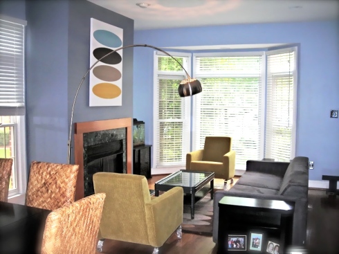
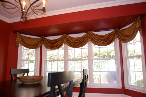
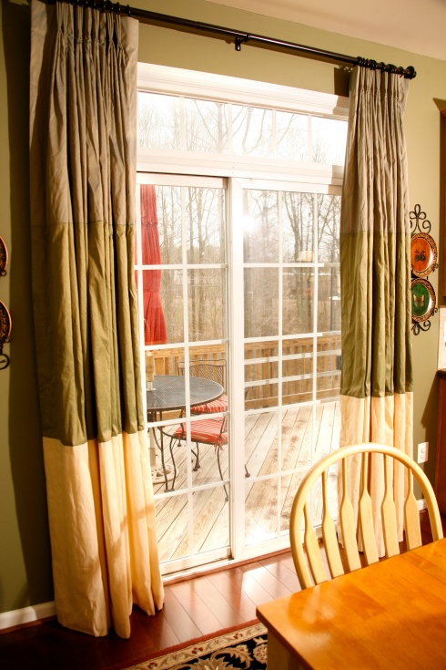
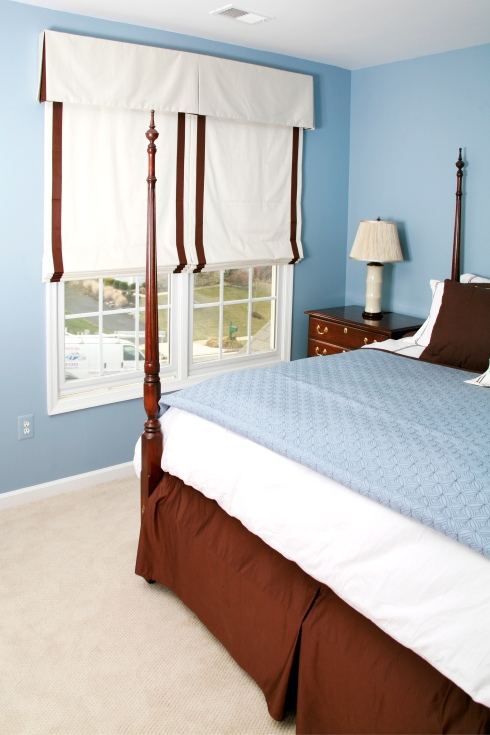
Check out some pictures of beautiful custom window treatments we’ve designed. Wait till you see what I have in store for my master bedroom and bathroom, and what I’m currently working on with other clients. I have to say I am feeling creative with window treatments these days… You can also check out our website to see more beautiful room photos at http://www.creativeeleganceinteriors.com.

